
Especially when it is an uplifting statement, like the following:

This is a picture quote from an Instagram user, @lift.inspire.share. I chose this item to analyze for a reverse engineer post because it is a great example of how to use typography to your advantage. There are multiple elements and a strong sense of contrast, which makes it a strong example.
Typeface 1- Sans Serif
The first typeface in this image is a sans serif font. It is easily identified by the lack of serifs on the characters, no thick/thin style, and an even mono-weight. The size is the same on this typeface throughout the design, except for the name of the designer at the bottom of the image.
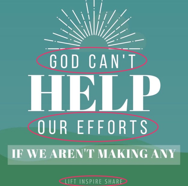
Typeface 2- Modern
The second typeface is distinctly modern. The thick/thin ratio is very extreme, with very thin, horizontal serifs. The size and weight varies depending on which line is being examined.

Contrast
There is quite a bit of contrast between these two typefaces. Before I mention the contrasts, however, there are some similarities I’d like to mention. First, the color is identical. In addition, the form of the characters is the same as well. All capital letters is in play here, which causes the reader to read each individual letter rather than the word as a whole. It creates a block effect with the words. A big difference between the two typefaces is the size and weight of the words. The Modern typeface is big and heavy, while the Sans Serif type is thin and regular in weight. The word “help” is much bigger than the phrase “if we aren’t making any” because of the length of the phrases. It also emphasizes the importance of the word “help.” Finally, the last phrase has a light text box around it, suggesting that the phrase is important and different than the rest.
Summary
@lift.inspire.share did a spectacular job at typography in this image. While there are a few improvements (such as possibly using left or right alignment or decreasing the space between the characters), the overall image is very well put together. Because the contrasting typefaces are used in the image, the visual appeal to the image is enhanced. There is direct emphasis on particular words, which helps the reader understand the message behind it. Reading quality typography pieces such as this truly is good for the soul. It is also easy on the eyes!
